How to make your images responsive?
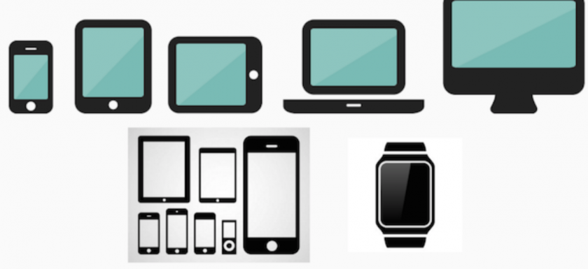
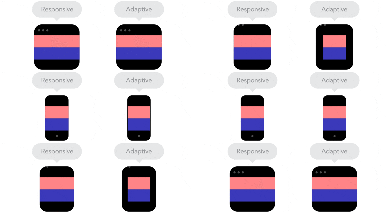
We currently have a wide variety of devices from which we access the internet. Smartphones, tablets, laptops, desktops, televisions, even clocks. They all have a different screen size and also a different resolution. An image on a smartphone can be seen very crisp, but this same file in a high resolution monitor will be pixelated. The ideal would be to have the same image but in several sizes and that the browser chooses what to present at any time. SRCSET attribute srcset is an attribute within the img element that allows us just this, to have several images in different resolutions, and the browser, dependingRead More →

