Creating CSS link hover effects helps a web page look more creative and fun. Here are three CSS effects for you to grab and use in your next project so you can stand out from the crowd.
- Hover Effect 1: Background Box Shadow
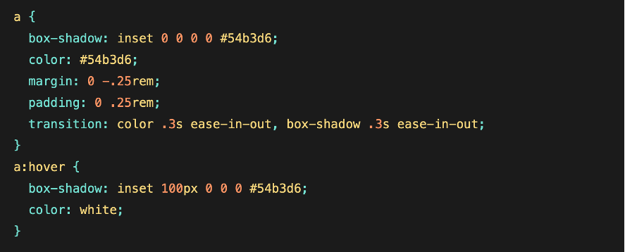
This effect will slide a background box shadow across the inline link, changing the color of the link text as it does so.
First, we apply padding around the link, then add a negative margin of the same value to prevent the padding from breaking the flow of the text. We’ll use box-shadow instead of the background property since it allows us to make transitions.

Below you have the sample code to better understand and apply this first effect.
- Hover Effect 2: Passing Underline
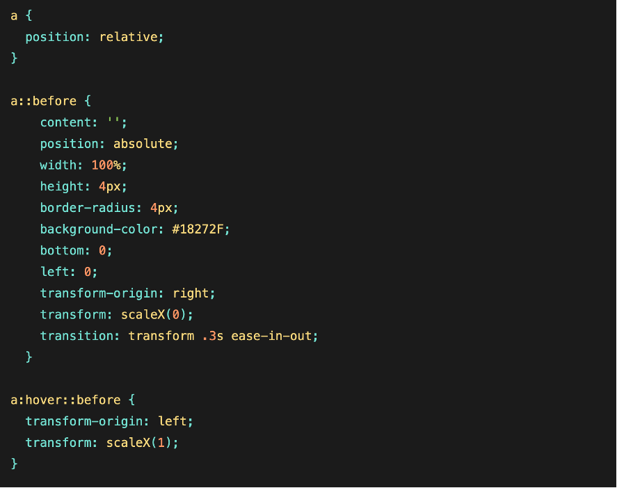
As you hover over this link, you’ll see the underline animate from the left and then disappear to the right.
We start again with position: relative; in the parent element
We style the ::before with some basic rules, including a border-radius: 4px; and thus give it a slightly softer appearance.
We’ll use the idea of the transition transform (transform: scaleX(0);) but we’ll change the origins of the transform.
So we start by setting transform-origin: right; in the : :before element.
Then on hover we use transform-origin: left;

- Hover Effect 3: Multi-Line gradient
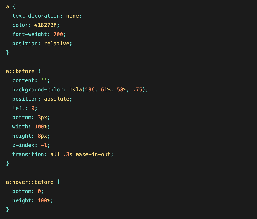
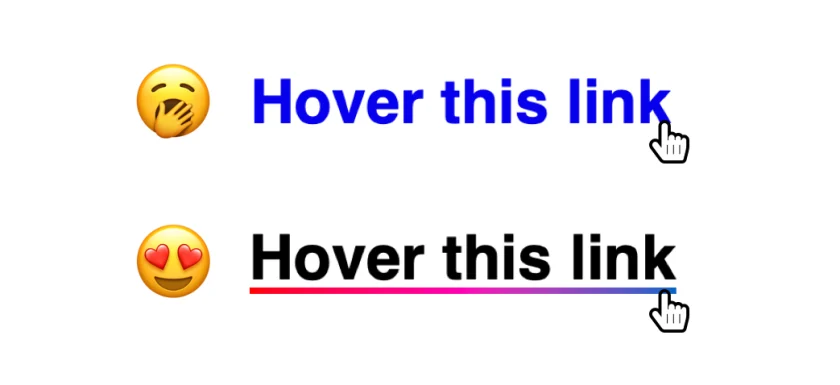
The idea is that you use the link’s ::before pseudo-element as a thick underline that sits slightly behind the actual text of the link. Then, on hover, the pseudo-element expands to cover the whole thing.
We make the background double the width of the link, from 200%, and position it all the way to the left. That way, it’s as if only one of the two gradient colors is showing.
The magic happens when we reach for a couple of non-standard -webkit-prefixed properties. One strips the color out of the text to make it transparent. The other clips the background gradient to the text so it appears the text is actually the color of the background.
Still with me? Now let’s make the link’s faux underline by putting ::before to use. We’ll give it the same color we gave the on the hidden portion of the link’s background gradient and position it under the actual link so it looks like a proper text-decoration: underline.
On hover, we slide ::before into place, coming in from the left:
Now, this is a little tricky. On hover, we make the link’s ::before pseudo-element 100% of the link’s width. If we were to apply this directly to the link’s hover, we’d make the link itself full-width, which moves it around the screen. Yikes!
Add a little transition to smooth things out:
And finally, the code of the last effect:

I hope you have enjoyed creating these link effects and developing your skills

