Do you know why is accessibility important? If not, you should!
The Web is fundamentally designed to work for all people, whatever their hardware, software, language, location, or ability. When the Web meets this goal, it is accessible to people with a diverse range of hearing, movement, sight, and cognitive ability.
However, when web sites, applications, technologies, or tools are badly designed, they can create barriers that exclude people from using the Web.
What’s more, accessibility is not just for these people. Accessibility is also for browsers that cannot load the content properly, for users that need to see content in big sizes, and also it’s great for better positioning your website at search engines (by the way, this is called SEO!).
So in this post I’m going to show you some really useful information for creating a web design that is accessible.
1. Use suficient contrast between the background and the foreground
Foreground text needs to have sufficient contrast with background colors. This includes text on images, background gradients, buttons, and other elements.

2. Don’t use just color to convey information
Color can be really useful to convey somes information. However, it should not be the only way information is conveyed. When using color to differentiate elements, also provide additional identification that does not rely on color perception.
So, for example, if a form has some required fields, use an asterisk in addition to color to indicate it.

3. Include image and media alternatives in your design
When doing your website design you should consider putting:
- Visible links to transcripts of audio
- Visible links to audio described versions of videos
- Text along with icons and graphical buttons
- Captions and descriptions for tables or complex graphs

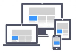
4. Create different designs for different viewport sizes
So your website shouldn’t look the same on a 24″ computer screen than in a 5.5″ smartphone screen.
You should consider how page information is presented in different sized viewports, such as mobile phones or zoomed browser windows.
Position and presentation of main (or any!) elements, such as header and navigation can be changed to make best use of the space. Ensure that text size and line width are set to maximize readability and legibility.

5. Use headings and spacing to group related content
You should use whitespace and proximity to make relationships between content more apparent. Style headings to group content, reduce clutter, and make it easier to scan and understand!

I hope you found this post interesting!

