Here are some very important factors to keep in mind when designing an interface. These factors can help you design faster and more efficiently and consistently, and also help you avoid many of the problems that designers can find in the process.
USE GRIDS!
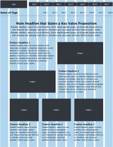
Grids are the basis of the user’s experience. Designing with grid is super important so the final design is more accurate and coherent, and allow you to place the elements in a visual sense.

The grids can be in many ways, depending on the design you want to realize, but the most common grid for aligning the elements is the vertical grid of 12 columns.
The grid is an element that we can only see during the design process, but it is very important, since if you have trouble locating the elements or creating an organized hierarchy, it can be very helpful!
BE COHERENT
Make the design as easy as possible for the users. A coherent design is easy to use and understand. The movements of the users and the visuals, must be similar in appearance and used in a single design that encompasses everything.
This means that the color, the moving style, the size of the titles and the text, the typographies, the icons, the images, the illustrations,… must maintain an esthetics associated with the brand throughout the entire platform that you are designing.
If all these elements are consistent, they will contribute positively to overall the usability, making the interaction between the platform and users much easier!
USING WHITE SPACES
White spaces help us to create a separation between the elements and facilitate their reading. These spaces allow us to set a rhythm and flow of reading, and create a kind of visual hierarchy that helps users to scroll through the platform in a better way.

White spaces are even more important in touch devices, such as smartphones, because the size of the screen is smaller. This additional space helps create a separation, facilitates the reading and the interaction with the device. For example, think about the improvement that brings some blank space when it comes to touching buttons. If they are very close, it is more difficult for users to press the appropriate button.
TYPOGRAPHY
Typography is a key element in understanding design, especially when it comes to an informative platform where we can find a lot of text. The most important of the typography is the legibility and comprehension that it has, and these concepts depend on how the font is chosen. When designing, we have to determine if the typography we are using is easy to read, for example, from a specific distance.
Another factor that can play for or against the readability of the text is the color we use in the background and in the text. They should try to use color palettes that create a high contrast so that they can be read easily.
An advice, in case of doubt, you can use serifa or dry stick fonts ( such as Helvetica, Roboto, Baskerville) , and set aside the handwrited and other baroque typographies.
PATTERNS OF USERS
Users can be grouped according to the specific way of doing things and moving through the screen, and each group of this one expects some specific things from the design of a platform. In order to achieve the greatest possible success, the design should use the patterns most commonly used according to the target audience.
What do we mean when we talk about patterns? For example:
- The order in which the information is placed
- Where to locate the navigation menus
- Position of icons, the chat, the search engine,…
I hope this tips may help some of you when designing your next interfaces!

