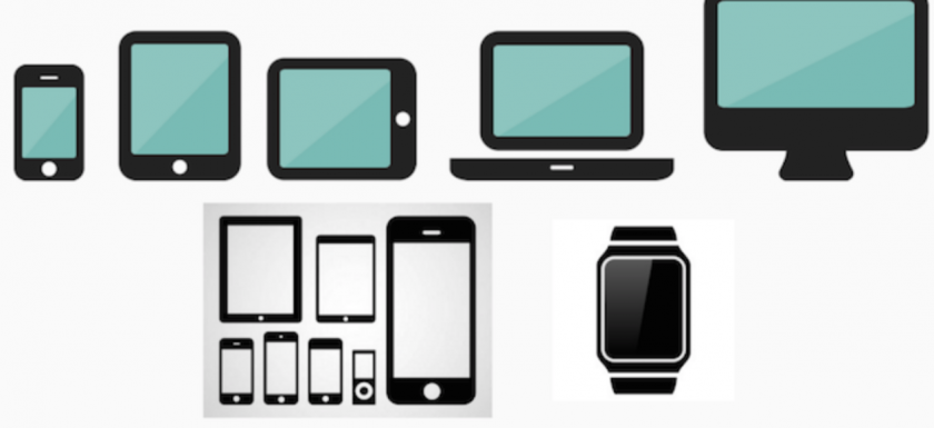
We currently have a wide variety of devices from which we access the internet. Smartphones, tablets, laptops, desktops, televisions, even clocks.
They all have a different screen size and also a different resolution. An image on a smartphone can be seen very crisp, but this same file in a high resolution monitor will be pixelated.
The ideal would be to have the same image but in several sizes and that the browser chooses what to present at any time.
SRCSET attribute
srcset is an attribute within the img element that allows us just this, to have several images in different resolutions, and the browser, depending on the size or resolution, will show one or the other.
To show an image we have made 6 copies of it, each with a different size.
• img-mobile.jpg
• img-mobileHD.jpg
• img-tablet.jpg
• img-tabletHD.jpg
• img-large.jpg
And we want each to be displayed at a certain time.
If we apply the Mobile First pattern, the ideal is that the first image or image by default is the least possible resolution. Thus mobile devices (with lower connection speed than in a desktop environment) can load the image faster.
To achieve this, in img src attribute we place the image of lower resolution: img-mobile.jpg.
![]()
We have another image, img-mobileHD.jpg with double resolution in case we are on a smartphone with a retina display. For the browser to load this image we placed it within the srcset attribute indicating the 2x parameter which causes the browser to understand that this image is rendered for a screen with double resolution.
![]()
The rest of images, for large tablets and screens, are placed within the srcset attribute separated by commas.
For example, for a tablet without a retina screen, we want it to be shown if the device’s screen is larger than 768 pixels, in this case we add the 768w parameter.
-The vector images are ideal for logos, icon fonts and especially shapes with flat colors. The most common format for these files is the .svg of Scalable Vector Graphics. To be constructed vectorial rather than with pixels, they can scale to multiple formats without losing quality.
-The rasterized images are already known to all. They are the images we can do with a camera. Unlike vectorized ones, if we scale an image from one small size to another larger, we will lose quality and we will see it pixelated.
We can follow the following guide described by Google Developers
• JPG for photos. When an image has many colors, it is the best option.
• SVG when we have a logo or images very linear and with solid colors (Without gradients). If we can not use SVG, we can use PNG or WebP
• PNG always better than GIF. It offers more colors and better compression ratio.
• Video for complex animations. Much better than a GIF, better image quality.
Reduce file size.
Although we use a compression system such as JPG or PNG, there are always a few kilobytes more than programs like Photoshop do not just efficiently compress.
Before that, wecan use some tools, both installable and online, that allow us to compress the images even more without losing quality.

