Hello, here you are going to find and understand some tips to make the user stay in your webpage, to make the user happy with his experience on your webpage…
I am going to give you tips on how to make a good structure, how to choose wisely the colors, the typography… Stay here and read, doesn’t is sound interesting?
1. First of all, the most important element on a webpage is the information architecture and how we navigate through it. So as each web site is different in terms of content, each web site will be different structured as well. As a consequence there is no example of structure that works with every webpage. But some important things to keep in mind while creating the structure are:
- Who will visit my page? – so depending on the audience we’ll have to create an easier navigation menu or not.
- What are my goals? – this may help you to focus on the main content your web site must have and keep it closer to the user. It must make sense.
- If you have a wide amount of content to put on your webpage, you must make very clear the subnavigations, but it’s not really recommended as the user may get lost in them. The user should be able to predict where the information he is searching for is. So create an horizontal menu with no more than two levels of navigation , I mean , with just one sub navigation menu if it is really needed. Remember: “less is more !”
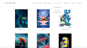
Here is an example of an easy navigation:

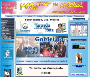
And here is an example of WHAT NOT TO DO :

2. Make the names of the tags in the navigation menu brief, specific. Do not repeat them or make them non-sense. Also it is not recommended to use instructions like: “Click here” or “More”, because the user doesn’t know what he’s going to find if he clicks there, so there are more probabilities that the user will not click there.
3. Another important design element to consider while creating a webpage is the typography. It seems simple to chose a typography but it isn’t, because choosing one is like choosing the idea or philosophy of your company you show to the user. It happens to be the same with the color. Here are some tips:
- Use font size of 10 or more. But for people with vision problems and children the font size must be between 12-14.
- Avoid too filled backgrounds.
- Avoid the anti-aliasing that some designers use to make the text more polished.
- Be aware that some typographies may have different font-sizes than the normal.
- Use a Sans font-family because they are really easy to read in line. Remember: do not use decorative fonts, they can be difficult to read
- Do not abuse of capital letters, as they make the lecture slow down.
4. About the colors : an easy way to make a text legible is to add a color contrast. For example : using black text over white backgrounds makes the lecture easier. Here are some other suggestions:
- Avoid using similar colors for the text and for the background.
- Be aware that there are some vibrant colors like yellow and purple that the combination could make the text illegible and tire out the eyesight.
- Offer a secondary indication when using a color to distinguish a relevant information. Some used colors are red and green.
5. Another thing to consider while thinking about user experience is a good writing. Seems stupid but sometimes while navigating on the Internet we might find some writing mistakes. A bad writing could condemn to failure a website. Some simple tips are:
- Hire a web writer.
- Know the user. This may help on deciding which language should we use on our website. If we make the vocabulary more specific and professional or if we make it more simple and easy.
- Do not use acronyms.
- Do not write too much.
- Do not use sarcasm or word games as they might distract the user.
Last but not least, I recommend you that before uploading a webpage to a server, make a test with some users. This is really effective and productive as it helps you to discovery any mistake that could have been missed while creating the page.
I hope this simple tips make you understand the importance of a website design , and help you to improve yours.
Thanks for reading !
And if you want to know more the lecture of “Prioritizing web usability” by Jakob Nielsen and How Loranger will get you satisfied, I can assure you !

