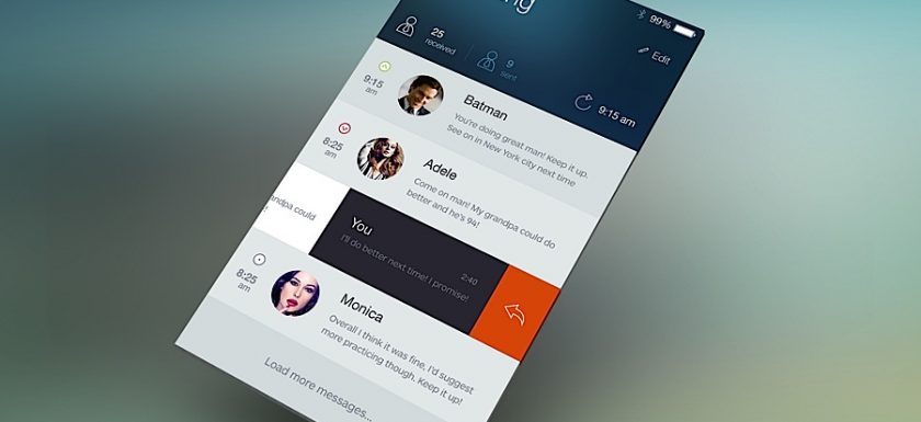
When making an interface design, it is very important to take care of the vocabulary and expressions, in this article we tell you some mistakes that we usually make when writing for an interface:
1. Use of technical words
We must bear in mind that the user does not have to have knowledge in the subject that we are dealing with, and a very common error is to use words that belong to the professional jargon in which the project moves or even to refer to very specific terms . The ideal in this sense is to write for all levels of readers and choose common words that are clear and easily understandable for beginner users.
2. Many details
In most cases, it is not necessary to describe every detail in the first interaction. It is better to do this, to reveal details about the characteristics when the user explores them, because he is not needing that information before.
Practical tips:
- For each message, ask yourself: does the user really need to know this?
- Write in small lines of text to prompt the user to discover. Keep sentences of less than 30 words when possible.
3. Tutting, and dealing with you
For those of you who dedicate yourself to the Copy world, you know very well that one of the initial decisions before starting with the elaboration of texts is to select the type of treatment that we will give to the user, well a very common error is to mix the treatment, in some cases use the “you” and in others the “you”.
4. Use of words for numbers
Space is very important in any design, so we recommend you use numbers instead of words when possible.
Incorrect: “You have three messages”
Correct: “You have 3 messages”
5. Texts in capital letters
Uppercase letters are fine for those spaces where you do not want to involve reading, for example, for acronyms or logos. However, when the message involves reading, do not force users to read in uppercase. Most readers agree that all capitals are less readable. You can always use uppercase for titles, headers, labels or menu items.
6. Use absolute words like “never”, “never” …
Never saying “never” is a great rule to follow.
Incorrect: “We will never send you emails”
Correct: “You will receive only important information”
Incorrect: “We will never disclose your data”
Correct: “We will not disclose your data”
7. Exclamation symbols
Like capitalizing, exclamation points are translated into the digital world as “screams,” and not all visitors like it.
Incorrect: “Welcome to our website!”
Correct: “Welcome to our website”
8. Male and female gender to express ourselves
Whenever possible we should use words that are ambiguous in terms of gender to avoid giving an incorrect treatment to theuser who is using our web / application.
9. Decorated phrases and expressions
You must use a simple and direct language that is easy for users to understand. All decorages of the type ‘must’ ‘, because’, ‘in order to’ must be omitted.
Incorrect: “Would you like to save the changes?”
Do: “Save changes?”
10. The expression Are you sure?
It is very common to add the expression “are you sure?” But we return to the same thing, the simpler the better.
Incorrect: “Are you sure you want to delete this photo?”
Correct: “Delete this photo?”

