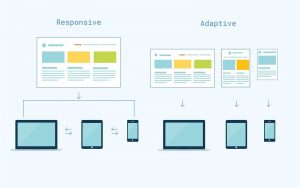
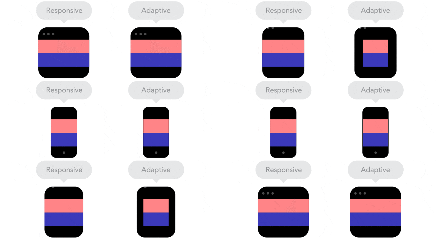
There is an amount of confusion when talking about adaptative and responsive design, but it remains clear when looking closer to them.
When talking about web design, it is very common to question about the differences between one and another because responsive and adaptative sites are the same in that both change appearance based on the browser environment they are being viewed on. But, why do exist two different concepts to talk about web design? What is the real difference between adaptative and responsive design? In this post we will try to analyze the concepts and solve all the doubts generated.
WHAT IS RESPONSIVE DESIGN?
The term “Responsive Web Design” was first coined by Ethan Marcotte, a web designer and developer, that makes reference to the act of designing websites that display correctly on all devices and screen sizes. This is the main reason why the site designed with a responsive design adapts its layout to the viewing environment, in other words, adjusts the placement of design elements to fit in the available browser space. A responsive design should respond to the user’s behavior and environment based on screen size, platform and orientation. This type of design usually makes the layout move dinamically within the environment in the specific browser it is being viewed on.
WHAT IS ADAPTATIVE DESIGN?
“Adaptative Web Design” is a term introduced by Aaron Gustafson, a web designer, that makes reference to a design and development technique that adapts to different screen sizes. This type of design typically uses fixed layout sizes within the environment in the specific browser it is being viewed on. The advantage of adaptative design is that allows the designer to create a more optimized interface design and a better user experience in different devices.
THE REAL DIFFERENCE BETWEEN ADAPTATIVE AND RESPONSIVE DESIGN
The main difference between responsive and adaptative design is that the first one responds to the size of the browser at any given point no matter the width may be, it adjusts its layout. But adaptative design, adapts to the width of the browser at specific points, in other words, the website is only concerned about the browser being a specific width, at which point it adapts the layout.
Another difference between these two concepts is the behavior, if its smooth or a snap design. Responsive design would be the smooth because it adapts its layout in a fluid way regardless of the device is viewed on. On another hand, adaptative design snaps into place depending on what browser or device is viewed on. In other words, a responsive design flows with the environment while adaptative design just snaps into place at a concrete environment. We can define adaptative design as flexible while responsive design could be defined as fluid.

We have to keep in mind different things about these concepts: a web is responsive by nature and it doesn’t need to respond or adapt to any devices until we start designing it. But adaptative type of design is useful for retrofitting an existing site in order to make it more mobile friendly. This allows you to take control of the design and develop for specific multiple viewports.

