1.“Humans Come First”
The first step is saying it out loud: “Humans come first.”
Now repeat it until you hear this phrase echo in your head before and during the design and planning phases of every project. And the way to do that is to actually be more human. Be intentional in actions, interactions and design. Most of all, empathize with your users.
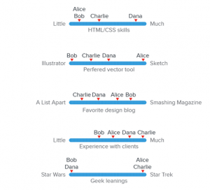
One way to ensure that you’re designing for humans is to create a user persona. You can use fictional identities composed from researching your users. This will help eliminate you guessing about your users and will allow to design with their needs in mind.

- Design for Comfort and Predictability
There are a few elements in the design process that you just can’t change, like device type and screen size. But you can affect how things render and how comfortable your designs are to use in different environments.
For a design to “feel right”, it must be comfortable to use.

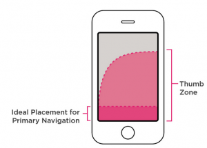
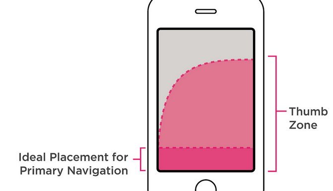
- Thumb patterns on mobile devices need to be reachable and accessible. Think about different phone, and hand, sizes when considering element such as buttons or swipe actions.
- Think about typeface size. Users should not squint to read the copy.
- Provide contrast that will stand up in varying conditions. While desktop users are most likely to view a website indoors, users might look at a screen in other lighting conditions with their various devices.
- Motions and movement should mirror real-life.
- Connect Emotionally
Focus on the one emotion your project should convey. Don’t get wrapped up in trying to create multiple emotional experiences. Do one exceptionally well.
The emotional connection is two-pronged:
- Your design should create a relationship between users and your product.
- Your design should create relationships between users.
 The color is a good way to stir emotions in people. Colors evoke different moods in people as well. For example:
- Red: Conjures up passion, and gets the blood pumping with excitement.
- Orange: Gives a whimsy lightheartedness to a design.
- Green: Promote prosperity, both physically and financially.
- Purple: Conveys the lap of luxury.
- Design With Simplicity
Websites such as Facebook, Twitter and Instagram thrive on this human factor. People are sharing their lives with other people. The design and interface is simply the vehicle that gets them there. All of these platforms started with simple tools for sharing and while they have grown in complexity over the years, the core usability is still easy to learn.

Start with simple visual elements:
- Color: Stick to one or two colors that are high in contrast. Keep cultural considerations in mind, especially if your website is designed for an international audience.
- Typography: The first rule of typography is that it must be legible and readable. All main body copy should be set at a level that is comfortable for the eye. For the best visual comfort, consider size and the number of characters per line.
- Space: More space makes a design feel open and inviting. Cramped lettering or elements that are too close together feel chaotic and jarring. It’s a tricky balance though, because wide open spaces can sometimes create the feeling that something is missing.
- Micro-interactions: Design interactions and notifications work in an almost invisible way. Like a simple hover animation, they add visual polish while giving users instant feedback.

